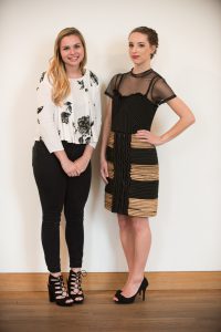
Last night the Weisman Art Museum hosted one of our favorite annual WAM Collective events is our exhibition inspired garment design showcase. Developed in collaboration with the College of Design, the yearly showcase features runway-ready garments created by undergraduate design students from non-traditional materials. Each year the course takes on a different theme, inspired by one of WAM's featured exhibitions.
This year questions of identity drove the designers, who considered the formation of identity through their creation. Inspired by WAM's exhibition The Talking Cure by Melissa Stern and featured artwork What Needs to Be Said? by Rebecca Krinke, this year's theme challenged each designer to create a piece that visually represents a self-presentation narrative.
Read up on the featured designers and Talking Cure inspired garments below:
Caroline Albers
Bio: Caroline Albers really enjoys daydreaming about clothing and she does so often. Her current work explores how powerfully clothing can express the internal thoughts we may or may not verbalize to others. Her goal is to make tangible the connections between psychological factors and the construction of a garment. When she’s not geeking out about textiles, Caroline is thinking about emotions, relationships, and how one can be a forward-moving person. She is continually inspired by the fact that every single person has a relationship to clothing.
Concept: The dress “am i doing this right?” is constructed of mesh wire, insulation foam, colored transparencies, and pieces of broken mirrors. My goal was to create a meta example of creating this garment, to create a representation of my mind during the design process. I live with anxiety and depression and my symptoms are exacerbated during the creation process. Internal contradictions like having a million ideas I am unable to articulate turn me into an emotional mess. I try to be easy on myself through the process, but my inner critic remains its harshest. While confident in my abilities, the idea of someone presenting a reaction to my work is paralyzing. During this project I focused on making room at the proverbial table for all my thoughts, each of them informing this dress. The vibrantly colored transparencies sticking out and positioned in different directions suggest hope and a desire to move forward in a positive mindset. The insulation foam oozes out at some points and stays behind the grid at others mimicking the confusion that is wanting to share all my thoughts and yet hide from everyone all at once.
Ellen Becker
Bio: Ellen Becker is an Apparel Design student at the University of Minnesota. Her interest in design began when she picked up her first Teen Vogue at age 12. Following her education, she plans to work as a technical designer for a large women's ready-to-wear company. As a current sales associate at Ann Taylor Loft in her hometown, she draws inspiration and values from the company’s silhouettes and aesthetic. As a result, Becker enjoys using structured shapes as well as high quality details.
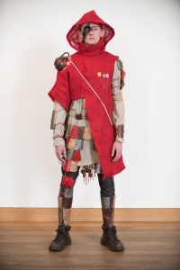
Concept: For this piece, I based my design off of the exhibit The Talking Cure. In viewing the exhibit, I felt as if the sculptures were representing people’s personal constraints –whether it was loss, love or themselves. I looked into my own life and found that anxiety was one of the main things that has kept me from being a leader or taking on new opportunities to further my design career. Looking at common objects to represent this experience, I found that the purpose of flat washers is to spread the surface pressure between two adjoining, uneven surfaces. This definition resonated with everything I have tried to do to combat the effects of living with an anxiety disorder, such as meditation, medication, exercise, etc.
The washers were a starting inspiration for my design, and I slowly built my idea for the garment from them. Using metal, I instantly thought of armor and the idea of arming yourself against the unknown. The weight of the washers is symbolic of the heavy pressure you feel on your chest and shoulders from the anxiety. Specific colors are used to embody darkness and hopelessness felt when having a panic attack, and a silver lining that gets you through the darkness. I created a criss-cross pattern with the washers to symbolize being at a crossroads with your decisions. I hope when people look at my design that they can see that the darkest things in your life can also morph into the most beautiful things.
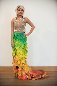
Lizzy Cobb
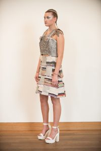
Bio / Concept: A 200 year-old oak tree in Lizzy Cobb’s childhood backyard has always been something she could count on. It has served as the inspiration and impetus for her creative work. After the loss of her father at age 15, Lizzy became very fragile in response to change. Through both exciting and devastating experiences, the tree was her constant. The year Lizzy lost her father, she painted the tree 43 times. In trying to cope with grief, change, and the loss of control she was faced with, painting the tree allowed her to sort out the emotions she could not verbalize. Bringing to life a structure so prominent to who she used to be allowed her to rediscover herself in an unknown world where everything had been flipped upside down. However, this hobby led to more than just acceptance; the further she explored different mediums and techniques, the bigger her love grew for art, eventually leading her to apparel design. Through this literal representation of the tree, Lizzy was able not only to represent the changes she has faced in the past, but also the ongoing change she continues to face. In the future Lizzy hopes to develop her design career in intimate apparel, making women of all shapes, sizes, and ages feel confident and empowered in what they wear.
The main focal point of this piece is the skirt. One thousand painted leaves made up of pages from a favorite book graduate in color, blooming at the top, slowly progressing through the seasons, and gradually dying away towards to bottom. As it comes down the runway, the blowing leaves move with the body, bringing the garment to life. The bodice is composed of rubber coated wire cast around the model and wrapped in strips of the book; this organic structure conforms to the model as it grows around her. Each branch stems from the trunk at the spine, the physical backbone of this ever-changing structure. There is irony in the concept of a tree as a constant in Lizzy’s life, for the tree itself goes through its own cycles of change, always growing and adapting to new environments and climates. Through this work, Lizzy eventually came to terms with the idea that there is stability in change; we are rooted in our experiences even as we continue to grow and learn from the changing circumstances around us.
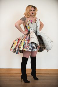
Emily Dufault
Bio / Concept: The life of an individual is full of ups and downs. Tragedy strikes and you have to choose whether to stay down or get back up. How does one rise up from tragedy? Some rise from traumatic times by channeling the drive and determination of not giving up, or through a the helping hands of others. The artist believes that no matter what, life goes on with or without you and tends to mask her emotions and close them off to be buried deep down inside. What she shows on the outside is much different than her inner self. Dark, hard, and cold emotions tend to lay on the inside, whereas the emotions she chooses to show tend to be more lighthearted and happy. That is her way of pushing through tough times and moving forward.
What happens when something tragic happens to someone you love and suddenly you find yourself taking on the burden of their pain and emotions? Though you want to take the pain away and make everything better for that person, deep down inside you know you can't. Understanding that your own health comes first before anyone else's is the first step in making both of your lives better. This project is about letting go of the pain and emotion we hold within our internal selves, and peeling back the our external masks.
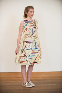
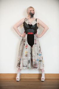
The artist has chosen to use magazines as a medium. Magazines provide a wealth of current information concerning a wide variety of knowledge. For this work, magazine covers represents the mask, usually covered in bright colors and graphics to catch the reader's attention. However, if a reader decides to go deeper into the pages, they might find that there is so much more to be discovered than meets the eye. Inside the pages of a magazine you can find photographs and articles that might not all be good news but that are also not all bad. This represents the inner-self. Hidden emotions do not always represent pain but simply things that do not wish to be seen.
The artist chose to use a wide variety of magazine types that covering a number of topics with an emphasis on fashion. Over the years, the fashion industry has been ridiculed and scrutinized for promoting unrealistic body expectations for women. This piece represents that a woman's body is her own and that she should be proud to be who she is. A woman should feel safe and confident in the body that she has been given.
Alexis Frey
Bio: Growing up in rural South Dakota, Alexis always felt the need to leave her jeans and t-shirt town and escape to the city. This led her to the University of Minnesota’s Apparel Design program. She gravitates toward creating designs that play with opposites, such as light and dark colors or hard versus soft edges. Alexis uses these elements to create visually unique designs. In the future, she aims to obtain internships where she can establish her design aesthetic and improve her technical design process. For now, Alexis continues to thrive in the studio, absorbing as much information as possible to further develop her skills as a designer.
Concept: Partial explores how the digital age causes people to create perceptions of one another based on information revealed to them across social networks. Those notions form hard edges without consideration of the subject’s true identity, but when the preconceived notions are peeled back, one can see the true colors beneath. This is represented through Alexis’s use of garbage bags, whose main role is to hide objects that people do not want to see. When the outer layer is removed, the model is allowed to break free from her unauthorized constraints and reveal her true colors underneath. The red and orange cellophane represents the designer’s personality traits as well as her hopes and dreams for the future.
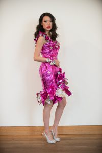
Ivan Gil
Bio: Representing the East, the West, and down South, Ivan Gil arrives to the University of Minnesota with a multicultural perspective about life, art and fashion. This is reflected in his work as he interprets his cultural influences into a form of visual art. Ivan’s fascination with fashion started at a young age when he was exposed to the fashion industry in his hometown, New York City. Due to life circumstances, Ivan started traveling internationally at a young age, which gave him the opportunity to expand his horizons and and allowed him to break out of the ordinary. As a FIDM alumni and a current student at the University of Minnesota, Ivan hopes to one day became a household name in the international world of fashion.
Concept: In this project Ivan was inspired by the loss of his maternal grandmother and the idea of gaining strength after losing a loved one. At the same time he was inspired by memories from his time living in Mexico as a child and the representation of nature in his life. Ivan decided to use plastic flowers as a tribute to his late grandmother and foil paper as the representation of the inner strength that he has build from his loss. The overall silhouette of the garment is a statement of his personal aesthetic as a designer, as he proves to stay true to himself.
Austin McCartney
Bio: Austin McCartney was born and raised in rural Wisconsin and now resides in Minneapolis, Minnesota where he studies apparel design at the University of Minnesota. His design view is simplistic, sophisticated, and modern. He is influenced by his rural roots and the contrast between the colorful earthy hues he comes from and the fast paced city lifestyle where he currently resides. He draws inspiration from the industrial mill-type architecture that shapes much of the Minneapolis area, as well as the wide range of music and artists that he is passionate about. As a designer, his goal is to blur the lines of gender roles in clothing, and to give creative types an artistic outlet in their appearance.
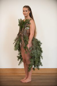
Concept: This dress is a couture dress, with earthy tones and an organic nature. The design features a corset dressed in bare tree branches, as well as shoulder accents and a bustle blooming with pine tree branches. The naked branches around the torso were whittled and shaved with a knife, pasted together with wood glue, and then fastened to aluminum rods that orbit the body. The bustle was made by fastening pine tree branches onto a cage, which was made by welding together steel rods. Austin’s couture garment is a physical reflection of his journey through his own understanding of himself and his sexuality, and how his self-image is perceived by others around him. The combination of the hard steel beams with the flexible pine needles represents the interaction of both masculine and feminine qualities in his life and journey thus far.
Michaela Morse
Bio: A hallmark characteristic of the role models in Michaela’s life is their ability to transcend their surroundings and work in a manner extending across academic, religious and social disciplines. With a desire to embody this quality, she chose to pursue apparel design intending to use the study of clothing as a platform to approach topics that are yet to be determined. For Michaela, fashion is a visual language which encompasses all aspects of humans’ interactions with our world; a form of expression in which she hopes she can find her own place.
Concept: Many of my classmates have never seen me without a mug in hand, regardless of time or place. Hot drinks provide me comfort everyday, beginning with my enjoyment in brewing them and continuing through the last revitalizing drop.
Presented with Melissa Stern’s interest in the story art objects tell, I considered the deep presence which hot drinks, and the mugs that hold them, have in my own story. How could my favorite daily ritual translate to a wearable art piece?
I researched armor from around the world to understand how the rigid material of a mug could be translated onto the body. This yielded methods to construct my piece, but left a gap in converting the warmth of my drinks to the stiff, harsh look of armor.
The addition of burlap, for its connection to coffee bean sacks, and coffee filters, as another textile-like material, added the wearability my design was seeking. Adorned with the tags from all types of tea bags and yerba mate I’ve enjoyed, my final look represents my love of a large spectrum of hot drinks.
Unexpected challenges with cutting and drilling through my ceramic mugs later shifted the ratio of non-traditional materials in my design more towards coffee filters, for the ease in manipulating them. To maintain some of the visual weight that the mugs gave to my look, I layered many filters together and molded them into the shapes of the ceramic pieces I’d originally envisioned, using fabric stiffener and Paverpol to cement their form.
Although unsure of my direction as an apparel designer, my work most often has its roots in my desire to learn more about other cultures and engage in other fields of study. The diversity of armor types, construction methods and hot drinks that informed my piece are ultimately a reflection of a global diversity I seek to experience.
Sarah Ramsay
Bio: As a designer, Sarah is inspired by nature, art, and her experiences with the world around her. She has always enjoyed creating art in her spare time, or taking various art classes throughout school. For a long time, drawing has been her favorite medium to work with, but more recently she has become intrigued by computer aided renderings and digital mood boards. Though she is not a photographer, both online and physical photographs are a prominent part of her inspiration and aid in her creativity as she pursues her education and career in fashion.
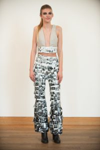
Concept: Inspired by Melissa Stern’s exhibition, The Talking Cure and Rebecca Krinke’s practice in What Needs To Be Said?, I thought about how other people might look at a piece of artwork or even a person and perceive it from the artists intentions. Social media is a huge catalyst to the idea that people can pick and choose what they want others to see, highlighting good and diminishing bad images. This understanding inspired me to use photographs as the signature medium of my design. I used achromatic photographs from my social media accounts to represent how people only see me in “black and white”. I also included photos that I choose not to post to social media because of censorship from my sorority or because I feel it is an imperfect image. This design includes these images to represent the sides of myself that I do not show everyone. The design also features upholstery from a couch to represent Freud’s talk therapy method and the “talking cure”. This is something I had never realized I do with my close friends, but talking with them allows them to see all sides of me, rather than just what I share on social media. The actual construction of my design is a cropped, open chest bodice made out of the couch upholstery. Attached to the bodice, a strip of my personal photographs that are joined together with mod-podge and sewn along the bottom of the bodice. Accompanying this piece is a pair of flared, high-waisted pants completely decorated in layers of photograph strips. This concept and design really took me out of my comfort zone, but I am excited to share these photos and my design with everyone.
Karli Rastetter
Bio: As a child, Karli was always searching for new projects – often neglecting to finish one before starting the next. Growing up in Ames, Iowa, surrounded by cornfields, she has always longed for a more dynamic atmosphere. With her desire to evoke emotions through her designs and a need for constant change, Karli has found comfort in the innovative world of fashion. She hopes to continue following her passions by contributing to something bigger than herself and plans to pursue a career in cinematic costume design, where she can bring stories and characters to life.
Concept: Through experimenting with straws, a new medium, Karli became interested in their potential to create form while playing with transparency and texture. By standing the straws on end and cutting them away, new planes can be created on the body. From different angles, the design seems transparent, allowing a look inside, but other times it is opaque, blocking color from view. She was inspired by how this visually represents her experience of opening up to others and how often the circumstances need to be just right for those interactions to happen. The longer straws of the final design also signify her growth as a person and how she is constantly discovering more about herself.
Genevieve Romain
Bio: Genevieve was born in Minneapolis, Minnesota and has always been involved in the arts. Born a young fashionista, she has always taken great pleasure in clothing. Growing up she was exposed to the world of design through her father who creates theatre sets. Though she started her artistic career on stage, she quickly realised being behind the scenes is what really drove her passion. She has always been encouraged to follow her dreams and loves to learn new skills. Her creativity and passion drive her to create fresh new ideas that she enjoys turning into reality. She often draws inspiration from the world around her and finds nature to be a great source for fresh ideas.
Concept: In creating this piece, Genevieve was inspired by words. In today’s world, people in power are encouraged to share their opinions. Even artists are probed for what they are thinking and feeling but most of the time women are silenced and urged to keep they mouths closed. She chose to manipulate a variety of written works to express her concept. She has made pants with newspaper, relating it to her idea that people are inclined to listen and engage in words written by the mainstream media. She then worked with paper mache to create a top from copies of her own writing, words she feels that others would rather not hear. In the end, she decided to paint over her words with black paint to represent the forced silence facing women in society today.
Madeline Rooney
Bio: Madeline has always had a passion for clothing as a form of expression. She draws from abstractions of her natural surroundings to influence her design work. A desire to learn, a strong sense of individuality, and a curiosity of the unknown continually inspire her designs. She seeks to explore new ideas and innovative ways to use technology and construction techniques as a way of creating new, useful, and sustainable garments. Madeline hopes to continue growing as a designer and use her skills in future work.
Concept: Viewing the exhibit “The Talking Cure” caused Madeline to look inside herself at insecurities that she has, pertaining specifically to the work that she creates. It is often hard for her to allow others to view her work during the process stages because it is not yet perfect. This insecurity carries over to even greater aspects of her life such as her relationship with herself and others. Madeline finds herself frequently looking at these areas and finding them unpleasant and unattractive. It took watching the collapse of a building, to realize that a large concrete structure, something so seemingly perfect and beautiful, cannot stand as such on its own. The unattractive foundation is essential in the formation of such a structure.
Materials for this project were inspired by building materials. Exposed wires and boards are not always the most attractive to the eye, but in order to build a successful structure those unattractive features and foundation are essential. Through this, Madeline is examining the parts about herself that she does not find attractive, but is choosing to view them as a form of growth rather than a fixed part of her character. The copper wire represents the framework of her skill sets, relationships with herself and others, and the beginning of a solid foundation to build from. Madeline is in the process of learning, growing, strengthening relationships and it’s not always pretty but it is important. The wire also represents the way that she feels constricted by the need for perfection in her work. Rather than hiding what she is working on due to imperfection, with this project Madeline wants to reflect the beauty of her design process and the raw sense of growth as she builders her foundation. By reminding herself that she is still learning, still growing, she hopes to stop being so hard on herself and become more comfortable with showing her design process, no matter how imperfect it may be.
Hailey Strobel
Bio: Hailey grew up with a strong interest in art and creativity. Throughout high school and college, she was involved in photography, ceramics, and drawing– anything that required her to work with her hands as a way to relieve stress. She had previously worked as an assistant art gallery coordinator, collaborating with different artists and faculty in organizing exhibitions. Through this experience, she discovered that she wanted to work in fashion. As a designer, Hailey is fascinated with exempting her prevailing moods and thoughts into a wearable garment that will appeal to her audience.
Concept: The source of inspiration for my garment is drawn from my childhood experiences going on family vacations to Montana. I am focused on these vivid memories that evoke emotions of happiness and curiosities for the world, and what these feelings mean to me. These memories specifically have made me nostalgic for simpler times, yearning for my innocence.
The garment is constructed with rag rug, sheet metal, and dried lavender. The design has a bright and whimsical softness in the rag rugs and lavender juxtaposed against the harsh and structured metal. These materials are used to represent the landscape and smell that remind me of Montana, and the overall silhouette is an embodiment of what a young child might wear; provoking an endearing impression to the viewer.
Stephanie Wang
Bio: Whimsical, playful and sweetly detailed. These are the words that inspire Stephanie’s designs as she imagines each new and unique look. Stephanie has been a maker all her life—experimenting through a variety of different mediums before realizing sewing is her favorite. The limitless details, silhouettes and materials used to create something that can be worn across the seasons are what she finds most exciting to play with. In this way, Stephanie hopes to contribute to a more sustainable fashion future by inviting people to appreciate their clothing and wear them more than just once or twice.
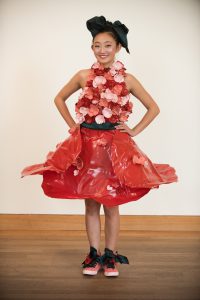
Concept: My dress is made of recycled bottles and sheets of PET plastic with mini wire LED lights intertwined in the top to create a warm glow throughout, like that of a candle. The bottles were cut up and melted into petal shapes with a candle flame, then assembled into flowers that cover the upper body. The skirt was created in a similar way with sheets of plastic melted with a heat gun to form an upside-down poppy flower around the waist. Finally, an emerald sash around the waist tied with a large bow at the back create a visual point of emphasis and a break between the very warm color scheme of red, coral and pink.
Through this garment, I chose to explore the importance of being a listener. Being an introvert, I listen more than I share so this dress is a physical representation of how I carry myself among others: bright and carefree so that the people around me might also become more cheerful. The candles used in making the dress are a metaphor of the time it takes to listen quietly and allow someone to speak until they feel better. An old Chinese phrase translates to say: “A candle gives light to others, and sacrifices itself”, much like the way I leave my own thoughts unsaid to be someone else’s ear.

Annie Yang
Bio: I am a third culture kid (TCK), which means I grew up outside of my parents’ culture. I have built relationships with both of my backgrounds, but never found ownership over either. The entanglement of identities from my developmental years has led me to look to simplicity in my designs. My inspiration comes from industrialism and history– developing a vision through the active incorporation of functionality and culture through the creation of clean lines and use of hardware. I represent my perspective as a TCK through design and creativity and hope to become the source of belonging and an anchor for youth who grew up as third culture kids.
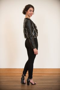
Concept: This piece is my reaction towards the political climate and the prospective future. It stands for my opinions and represents the words that are heard only in my head. This piece is my way of speaking out and standing up, of expressing my feelings and showing my fears. It’s symbolic in a way that can be relatable, allows for freedom of interpretation, but still personal and self-defining. This piece is a statement that can be both seen and heard.
The garment is composed of 1¼” metal key rings, linked together by means of smaller, ½” metal key rings, with thin leather strap detailing across the entirety of the back. It takes the shape of the body: wrapping around the base of the neck, curving to the shape of the figure, and reaching down the length of the legs to the floor with a generous slit opening from the high left hip. The garment is accompanied by a single knee pad that is customized and composed of various leather patches. The knee pad is suspended among rows of ¾” metal key rings, linked together by the same smaller, ½” key rings, and secured around the back leg using thin leather straps. It is worn on the left leg and exposed by the high slit of the garment, which when walking, creates a complimentary, audible sound.
Despite the asymmetry made noticeable in the details, the garment is balanced between the front leg exposure and the nearly bare back exposure. Tactically, the piece is rough, yet simultaneously, visually fluid. It displays unity and consistency throughout due to the sole use of metal and leather. The garment is weighted and heavy, but lightly brushes the ground. Between the garment itself and its knee pad counterpart, the piece as a whole creates an audio as the metals clash from movement.
Madison Young
Bio: I grew up in a town of about 2000 people. To most, fashion was a simple pair of jeans and a t-shirt. To me however, fashion and apparel design has always been so much more. The chance to emerge from that small town into the great city of Minneapolis has been so exhilarating. Living in a big city now, I get to experience new styles and truly live out my passion every single day by expanding my knowledge about something I love: fashion. I hope to use my degree in Apparel Design to work for a hands-on company in the fashion industry to further my experience and live out my passion.
Concept: Rope is strong and sturdy. It can be used for a number of activities whether you are rock climbing or jumping rope or building a house. It holds up to a number of tests; it is hard to bend, and hard to break, and stays together through any strenuous pulling. I identify as rope. The way we, as humans, handle the unexpected experiences that are thrown at us is what counts. Losing someone close to me to suicide has undoubtedly been the hardest thing in my life thus far. But I chose to be like the rope - strong and sturdy. Through this tough experience, there has been so many sources of support. My mom has always been such a strong person in my life through it all. She keeps me grounded, and holds me together when I needed it the most. And for that, I can’t thank her enough.
In my design, I have used the black climbing rope to symbolize the way life has challenged me. The twisting represents the moments I needed someone to help hold me together, such as my my mom supporting me. The frayed ends show that although I struggle, I don’t detach from the strong and sturdy rope. The gold represents the times I had to be strong for others, and when my talents shine through for those I love. Sometimes we are unable to stay together through difficult times, but at the end of the day we are part of a bigger, stronger rope that remains together and intact.